December 2017 - January 2018
Olivia Maki and Mike Reis reached out to me in late 2017 about a dream of theirs: to make cider as relevant as beer or wine, here in the Bay Area.
They were in the process of opening a cider bar and bottle shop, and wondered if I could help provide a logo and starting assets. At the time, they had not yet secured a location, but it was easy to see their passion and talent would ensure the project would come to life. If you haven’t already, be sure to check out Redfield the next time you’re in the East Bay. It’s well worth a visit (or two)!

Included Projects
Logo and development sketches
Patterns & Illustrations
Applied use
No. 1
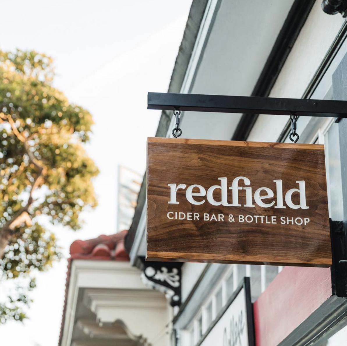
Designing the Logo
I started the process with lots of sketches, and many early iterations that were heavy on playfulness. After several rounds of review, we narrowed in on a more refined, type-based logo that made the most of the “fi” ligature and a slightly rotated “e” to fit neatly between its surrounding serifs.
Initial sketches and color explorations:
No. 2
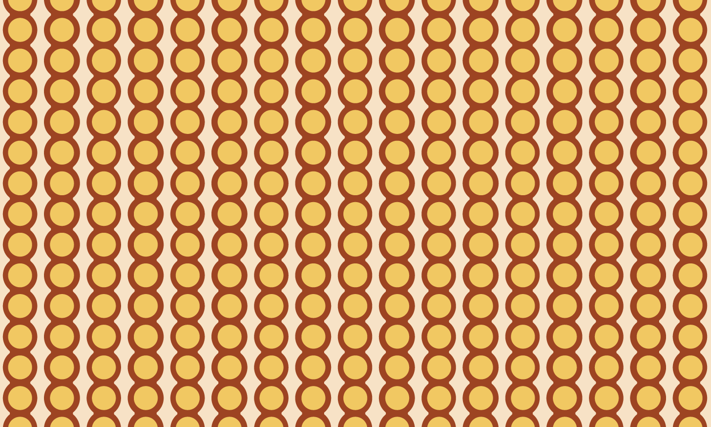
Patterns & lllustrations
To contrast the refinement of the logo, I created the illustrations from cut paper, which I then turned into vectors. The messy edges and simple shapes lend themselves well to being scaled and used graphically in applied use.

No. 3
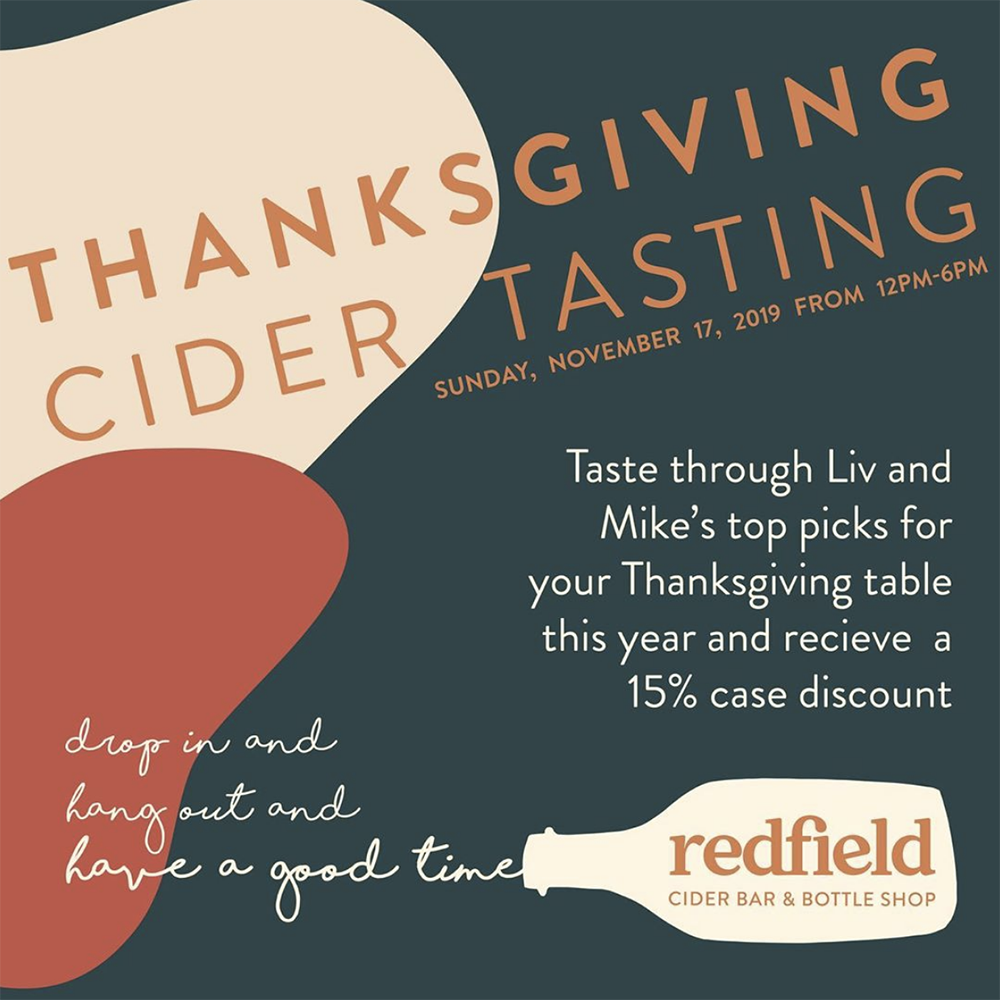
Applied Use
The best (and sometimes hardest) part of creating design work is seeing how it translates to the “real world”. It’s been fun to see the evolution of how Liv and Mike have transformed the starting assets into their own brand.